

≣ 목차
제목 이미지 교체 및 물결효과
저번 블로그홈에 물결효과에 이어서 이번에는 글 제목에 이미지 교체 및 물결효과를 적용시켜보겠습니다.
제목 이미지 변경 및 물결 효과

제목 이미지 변경
먼저 변경할 이미지를 준비해 줍니다. 저는 1280 x 340 해상도의 이미지를 준비했습니다.
파일 이름을 영문으로 해야합니다.

이미지 업로드
관리자 홈 > html 편집 > 파일 업로드로 가서 추가를 해줍니다

업로드한 이미지의 링크 주소를 복사 해줍니다.
https://tistory1.daumcdn.net/tistory/6364502/skin/images/background.png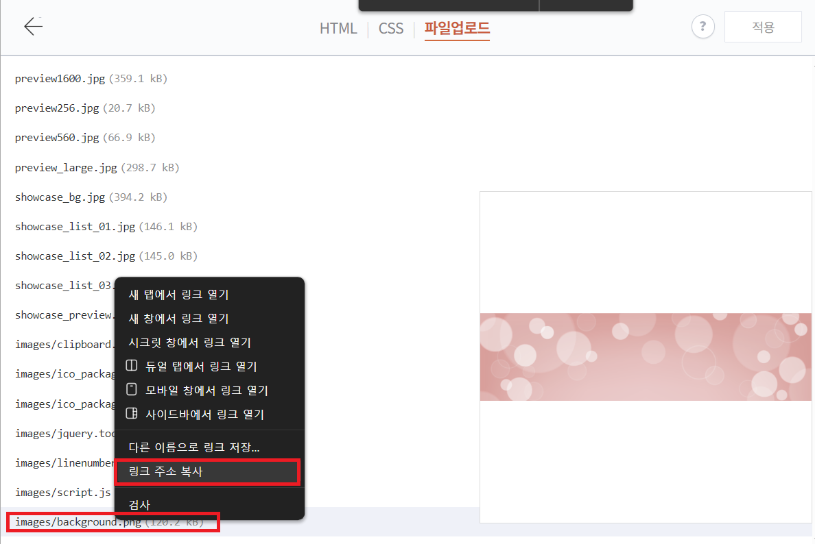
html 수정
관리자 홈 > html 편집 에서 <div class="post-cover" <s_article_rep_thumbnail> 를 검색해서 찾아줍니다.
<div class="post-cover" <s_article_rep_thumbnail>
아래 보이는 [##_article_rep_thumbnail_raw_url_## ]를 삭제 후 위에서 복사한 백그라운드 이미지 url 을 붙여넣기 해줍니다.
삭제 할 때는 [] 를 포함해서 삭제해야합니다.


제목 물결 효과 만들기
html 수정
관리자 홈 > html 편집으로 들어간 후 html 탭에서 ctrl+f 로 "<s_permalink_article_rep>" 를 검색해 줍니다.
<s_permalink_article_rep>
아래에 보면 <div class="inner"> 가 있습니다.
<div class="inner">
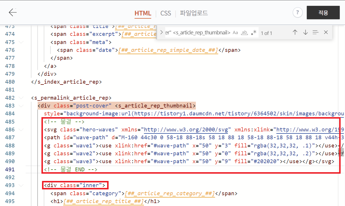
<!-- 물결 -->
<svg class="hero-waves" xmlns="http://www.w3.org/2000/svg" xmlns:xlink="http://www.w3.org/1999/xlink" viewBox="0 24 150 28 " preserveAspectRatio="none"><defs>
<path id="wave-path" d="M-160 44c30 0 58-18 88-18s 58 18 88 18 58-18 88-18 58 18 88 18 v44h-352z"></path></defs>
<g class="wave1"><use xlink:href="#wave-path" x="50" y="3" fill="rgba(32,32,32, .1)"></use></g>
<g class="wave2"><use xlink:href="#wave-path" x="50" y="0" fill="rgba(32,32,32, .2)"></use></g>
<g class="wave3"><use xlink:href="#wave-path" x="50" y="9" fill="#202020"></use></g></svg>
<!-- 물결 END -->
CSS 추가
관리자 홈 > html 편비 > CSS 탭으로 이동 한 후 맨 아래에 코드를 붙여넣기 해줍니다.
.hero-waves {
	/*웨이브*/
	display: block;
	width: 100%;
	height: 60px;
	position: absolute;
	right: 0;
	top: 270px; /* 물결 높이 위치 */
	z-index: 10;
}
@media screen and (min-width: 344px) {
  .hero-waves {
    height: 70px; /* 특정 화면 크기 이상에서만 높이를 70px로 재정의 */
  }
}
.wave1 use {
	fill: rgba(253, 253, 255, 0.2);
	-webkit-animation: move-forever1 10s linear infinite;
	animation: move-forever1 10s linear infinite;
	-webkit-animation-delay: -2s;
	animation-delay: -2s;
}
.wave2 use {
	fill: rgba(253, 253, 255, 0.5);
	-webkit-animation: move-forever2 8s linear infinite;
	animation: move-forever2 8s linear infinite;
	-webkit-animation-delay: -2s;
	animation-delay: -2s;
}
.wave3 use {
	fill: rgb(253, 253, 255, 1);
	-webkit-animation: move-forever3 6s linear infinite;
	animation: move-forever3 6s linear infinite;
	-webkit-animation-delay: -2s;
	animation-delay: -2s;
}
.dark .wave1 use {
	fill: rgba(49, 52, 60, 0.3);
	-webkit-animation: move-forever1 10s linear infinite;
	animation: move-forever1 10s linear infinite;
	-webkit-animation-delay: -2s;
	animation-delay: -2s;
}
.dark .wave2 use {
	fill: rgba(49, 52, 60, 0.5);
	-webkit-animation: move-forever2 8s linear infinite;
	animation: move-forever2 8s linear infinite;
	-webkit-animation-delay: -2s;
	animation-delay: -2s;
}
.dark .wave3 use {
	fill: rgba(49, 52, 60, 1);
	-webkit-animation: move-forever3 6s linear infinite;
	animation: move-forever3 6s linear infinite;
	-webkit-animation-delay: -2s;
	animation-delay: -2s;
}
@-webkit-keyframes move-forever1 {
	0% {
		transform: translate(85px, 0%);
	}
	100% {
		transform: translate(-90px, 0%);
	}
}
@keyframes move-forever1 {
	0% {
		transform: translate(85px, 0%);
	}
	100% {
		transform: translate(-90px, 0%);
	}
}
@-webkit-keyframes move-forever2 {
	0% {
		transform: translate(-90px, 0%);
	}
	100% {
		transform: translate(85px, 0%);
	}
}
@keyframes move-forever2 {
	0% {
		transform: translate(-90px, 0%);
	}
	100% {
		transform: translate(85px, 0%);
	}
}
@-webkit-keyframes move-forever3 {
	0% {
		transform: translate(-90px, 0%);
	}
	100% {
		transform: translate(85px, 0%);
	}
}
@keyframes move-forever3 {
	0% {
		transform: translate(-90px, 0%);
	}
	100% {
		transform: translate(85px, 0%);
	}
}
/* 물결 END */
물결의 높이는 .hero-waves 의 top: 270px; /* 물결 높이 위치 */ 에서 270 숫자를 변경해서 조절 해주면 됩니다.
마무리
저번 블로그 홈 물결 효과 적용 후 본문 상단 까지 적용을 하니 점점 더 예뻐지는 것 같네요. 여러분도 한번 적용해보세요~!
2025.08.20 - [일상/티스토리 꾸미기] - 티스토리 꾸미기 :: 블로그홈 상단 이미지 물결 효과
티스토리 꾸미기 :: 블로그홈 상단 이미지 물결 효과
≣ 목차 서칭을 하다가 재미있어 보이는 효과가 있어 포스팅을 보러 오시는 분들께 뭔가 이목을 끌 수 있겠다 싶어 퍼오게 되었으니 같이 한번 보시죠. 본문 상단 글제목 물결 효과 만들기 물결
ygwoo84.tistory.com
'티스토리 꾸미기' 카테고리의 다른 글
| 티스토리 꾸미기 :: 개발자 도구 콘솔창 차단 방법 (32) | 2025.09.02 |
|---|---|
| 티스토리 꾸미기 :: 블로그 상단 프로그레스바 꾸미기 (37) | 2025.09.01 |
| 티스토리 꾸미기 :: 서식(HTML) 스타일 모음 (20) | 2025.08.27 |
| 티스토리 꾸미기 :: 이미지 로고 적용하기 (27) | 2025.08.26 |
| 티스토리 꾸미기 :: 상단 로고 크게 만들기 (32) | 2025.08.25 |


