
728x90
반응형

프로그레스바 TOP 버튼 만들기
안녕하세요.
오늘은 티스토리 꾸미기를 해보겠습니다.
밋밋할수 있는 포스팅에 프로그레스바 버튼을 만들어 주면
세련된 화면을 연출 할 수 있으니,
한번 도전해보세요~!.
장점
진행도 즉시 피드백 → “얼마 남았는지” 직관적이에요.
완료 동기 부여 → 끝까지 읽기/작성 유도돼요.
즉시 맨 위 이동 → 탐색 복구가 빨라요.
단점
화면/공간 가림 → 특히 모바일에서 충돌 많아요.
시각적 방해 → 일부 사용자는 거슬릴 수 있어요.
접근성·성능 리스크 → 스크린리더 과공지, 스크롤 렉, 제스처 충돌 가능해요.
프로그레스바 탑 버튼 HTML 편집
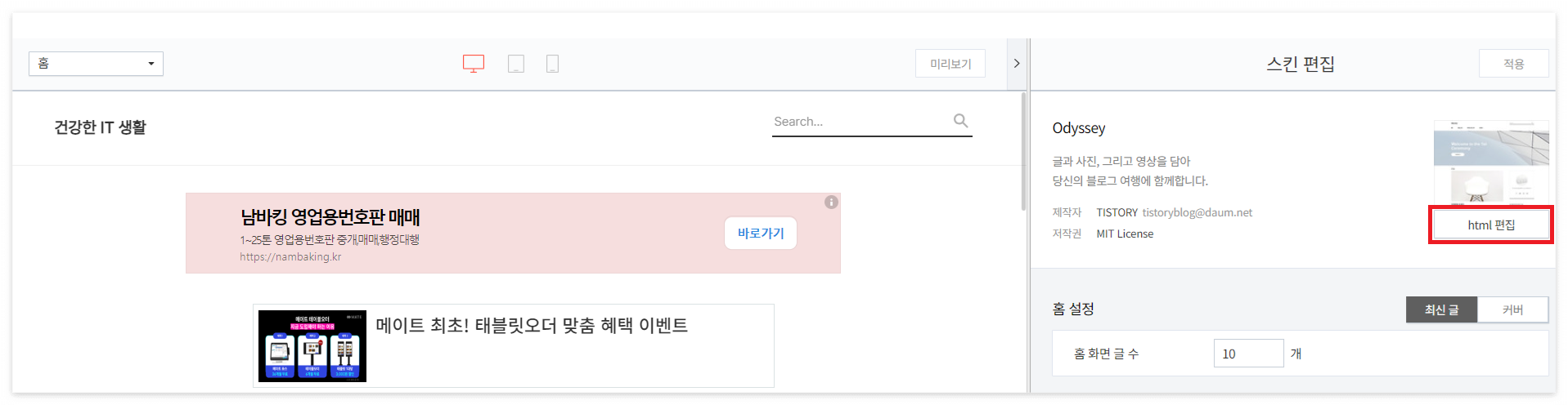
관리자 홈 > 꾸미기 > 스킨 편집 > html 편집 > html 탭으로 이동해주세요.
아래 코드를 복사해서 </body> 위에 넣어줍니다.
<!--위로버튼&프로그레스바 HTML-->
<div class="progress-circle">
    <div class="gotop">
        <span class="dial"></span>
        <a class="top-btn">top</a>
    </div>
</div>
<script src="https://s3-us-west-2.amazonaws.com/s.cdpn.io/72900/jquery.knob.min.js"></script>
<script>
    $(document).ready(function() {
	    var offset = 100,
		    scroll_top_duration = 700,
		    $go_top = $('.gotop'),
		    $thedial = $('.dial'),
		    $progress_circle = $('.progress-circle');
	    $thedial.knob( {
		    'min' : 0,
		    'max' : 100,
		    'width' : 70, <!-- 프로그레스바 크기 -->
		    'height' : 70, <!-- 프로그레스바 크기 -->
		    'bottom' : 300,
		    'fgColor' : '#d31919', <!-- 프로그레스바 색상 -->
		    'skin' : 'tron',
		    'thickness' : .08, <!-- 프로그레스바 굵기 -->
		    'displayInput' : false,
		    'displayPreview' : false,
		    'readOnly' : true
	    });
	    $(window).scroll(function() {
		    ($(this).scrollTop() > offset) ? $progress_circle.addClass('is-visible') : $progress_circle.removeClass('is-visible');
               var s = $(window).scrollTop(),
                   d = $(document).height(),
                   c = $(window).height();
		    scrollPercent = (s / (d-c)) * 100;

		    $('.dial').val(scrollPercent).change();
	    });
	    //위로 가기
	    $go_top.on('click', function(e) {
		    e.preventDefault();
		    $('body,html').animate( {
			    scrollTop: 0 ,
		    }, scroll_top_duration);
	    });
    });
</script>
<!--위로버튼&프로그레스바 HTML END-->

'적용'을 눌러 저장합니다.
프로그레스바 탑 버튼 CSS 추가
HTML 옆에 CSS 탭으로 들어가줍니다.
아래 코드를 복사해서 CSS 탭 하단에 붙여넣어줍니다.
/* 위로 버튼&프로그레스 바 CSS*/
.gotop {
    width: 70px; /* 탑 버튼 크기 */
    height: 70px; /* 탑 버튼 크기 */
    font-weight: bold; /* 폰트 굵기 */
    color: #f3c4d9;
    border-radius: 50%;
    background: #ffffff80 !important; /* 탑 버튼 배경색 */
    box-shadow: 0 0 15px #4f839750; /* 탑 버튼 그림자 */
    text-align: center;
    line-height: 60px !important;
    font: normal 16px "InkLipquid"; /* 폰트 크기 "폰트 종류" */
    transition: all .8s;
    cursor: pointer;
    -webkit-transition: .8s;
    -moz-transition: .8s;
    -o-transition: .8s;
}
.gotop:hover{
    animation: btn-top 3s infinite;
    color: #fff;
    font-weight: bold;
    background: #f3c4d9 !important; /* 마우스 오버 배경색 */
}
@keyframes btn-top {
    0%, 100% {transform: scale(1);}
    25%, 75% {transform: scale(.8);}
    50% {transform: scale(1.1);}
}
.progress-circle {
    width: 70px !important;
    height: 70px !important;
    position: fixed;
    right: 40px; /* 버튼 가로 위치 */
    bottom: 40px; /* 버튼 세로 위치 */
    display: flex;
    text-align: center;
    transform: scale(0);
    transition: .5s;
    -webkit-transition: .5s;
    -moz-transition: .5s
}
.is-visible {
    opacity: 1;
    transform: scale(1)
}
.top-btn {
    position: absolute;
    width: 50px;
    height: 50px;
    font-size: 20px; /* 폰트 크기 */
    line-height: 50px;
    color: #f3c4d9 !important; /* 폰트 색상 */
    right: 10px; /* 폰트 가로 위치 */
    top: 8px; /* 폰트 세로 위치 */
}
.top-btn:hover{
    text-decoration: none !important;
    color: #fff !important; /* 마우스 오버 폰트 색상 */
    font-weight: bold;
}
/* 위로 버튼&프로그레스 바 CSS END*/

TOP 글꼴 바꾸기
https://noonnu.cc/font_page/407
제가 사용한 TT 투게더 인데, 해당 폰트 웹사이트에서 확인 할 수도 있고, 하단의 코드를 복사해서 CSS 탭에 넣으셔도됩니다.
@font-face { font-family: 'TTTogether'; src: url('https://cdn.jsdelivr.net/gh/projectnoonnu/noonfonts_2001@1.1/TTTogetherA.woff') format('woff'); font-weight: normal; font-style: normal; }
마무리
참고로 모바일 화면에서는 커졌다가 작아지는 애니메이션이 화면을 클리하기 전까지 멈추지 않는 단점이 있으니,
참고 부탁합니다.
728x90
반응형
'티스토리 꾸미기' 카테고리의 다른 글
| 티스토리 방문자 수가 늘지 않는 이유, 바로 키워드 때문입니다 (26) | 2025.08.19 |
|---|---|
| 9월부터 티스토리 "모바일 전면광고" 금지!!! (41) | 2025.08.18 |
| 티스토리 탑(TOP) 버튼 만들기 (38) | 2025.08.11 |
| 티스토리 인용구 따옴표 닫기 만들기 (56) | 2025.08.04 |
| 티스토리 자동목차(TOC) 만들기 (38) | 2025.08.01 |


